 |
|


 Aug 05, 2009, 04:43 PM // 16:43
|
#41 | |
|
Lion's Arch Merchant
Join Date: Dec 2007
Location: USA [GMT -5]
Guild: State of the Nolani [gusy]
Profession: A/
|

Quote:
Minor corrections to proportions would make it better but imo Morag's pose concept is fundamentally sound [again I'm have no idea if that's a smart idea for a real archer but yay srs bzness strikes again]. |
|

|

|

|
Aug 05, 2009, 06:22 PM // 18:22
|
#42 |
|
Wilds Pathfinder
Join Date: Mar 2006
Location: CA
Profession: N/
|
@nian, even with your corrections to qing guang's thing, it still looks awkward. Her shoulders aren't resting on the arm chair, and she's not leaning forward either. Makes it look awkward. I still think the chair should be a bit more diagonal to keep in line with her back,
I'll look at yours later, no time right now D: @espadon, I dunno, imbalance is fine when in motion, but she's holding a bow steady, and she looks like she'll topple over D: Last edited by BlueXIV; Aug 05, 2009 at 06:25 PM // 18:25.. |
|
|
|
|
Aug 05, 2009, 06:53 PM // 18:53
|
#43 |
|
Lion's Arch Merchant
Join Date: Dec 2007
Location: USA [GMT -5]
Guild: State of the Nolani [gusy]
Profession: A/
|
We can carry on forever with stuff like "maybe she's dodging an incoming erfshakkur" so yeah.
Just go with whatever looks good. |
|
|
|
|
Aug 05, 2009, 07:35 PM // 19:35
|
#44 |
|
Lion's Arch Merchant
Join Date: Mar 2006
Location: sheffield
Guild: Arutha's Gatekeepers
Profession: E/Me
|
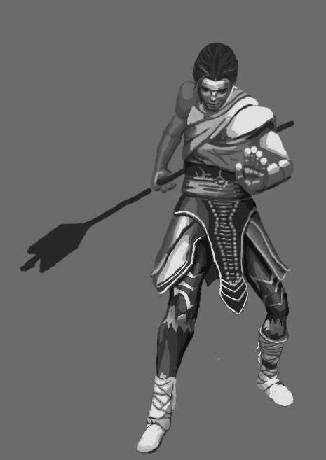
Im here for my ego-crushing!
O'shoot , edit for the proper layout:P Stage of Development: Finished (not that pencil sketch thingy though) Please look at: All of it! Harshness: errr 5-8? Comments/Notes: Paint Okay?: Yesh http://img5.imageshack.us/img5/765/scan0004cca.jpg EDIT -Added this pencil sketch/incomplete outline thing http://img21.imageshack.us/img21/9048/scan0003god.jpg A previous piece http://img6.imageshack.us/img6/5659/scan0001y.jpg Pleeeease bear in mind im a TOTAL newb, id love tips on drawing faces (i really dont enjoy it and im not good at all) Any strengths? any more weaknesses? I want to get better, so much so im going out to buy a complete art set this weekend >< to turn it into a hobby!! thanks xxfey Last edited by Fey; Aug 05, 2009 at 07:44 PM // 19:44.. |
|
|
|
|
Aug 05, 2009, 08:19 PM // 20:19
|
#45 |
|
Auctions Mod
Join Date: Jan 2006
Location: UK
Guild: Mystic Spiral [MYST]
|
 Title: Concepty Rit/Can I learn to use my tablet Stage of Development: 50% of primary subject done, about 20% of overall idea Please look at: Hand in front, leg shading Harshness: 7 Comments/Notes: The finished piece may or may not be greyscale, haven't decided yet, but since I know shading is a huge downfall of mine cos I assume stuff and don't actually look I forced myself to draw in b&w. The front hand to me just looks... well not right. Its not finished or got the detailing on, the finished piece has destroyer gloves on (which are chunky, but even still). Legs are finished, leggings not. Paint Okay?: Yes @Fey: Piece 1 looks like it needs more contrast in it. The highlighted areas aren't a lot lighter than the darker areas and that leads her to look flat. The face in general is good but to me looks like the eye area wants to move down the face slightly - that will give her more of a forehead and bring it in line with the nose. I'll let the more qualified give better advice but those were the things that jumped out at me. |
|
|
|
|
Aug 05, 2009, 08:25 PM // 20:25
|
#46 |
|
Lion's Arch Merchant
Join Date: Mar 2006
Location: sheffield
Guild: Arutha's Gatekeepers
Profession: E/Me
|
Thanks tasha! I completely agree about the eye, however i noticed it too late on xD
Highlighting also a good point, i was using watercolours, i did once try to give more highlights but to me they looked dark, il think il experiment wth several copies of my sketch and colour it varying, that'l help me in that department 
|
|
|
|
|
Aug 05, 2009, 08:59 PM // 20:59
|
#47 | |
|
Wilds Pathfinder
Join Date: Mar 2007
Location: Finland
Profession: R/
|
Quote:
LEt's not turn this into a debate thread though. It is better to just give our own thoughts and suggestions and the artists can decide wheter it is of any use to them or not. I purposefully ignored everyone else's comments and only read them after I had written my own comments so I would not be affected by other's thoughts. This way the similiarities in some crits perhaps make them more credible? 
|
|
|
|
|
|
Aug 05, 2009, 09:07 PM // 21:07
|
#48 |
|
Pyromaniac
Join Date: Aug 2005
Profession: Mo/W
|
@Fey When drawing faces, it's probably helpful to attempt to exhaustively draw real life faces a couple times. The details on a face are particularly important, more so than other parts of our body, because our brain has evolved to uniquely recognize other human faces (there is a part of our brain devoted solely to face recognition). That's why sometimes you'll draw a face and it'll just look wrong. On your face that you've drawn, a couple things stand out to me. The eyes are too wide open, human faces normally have the top quarter of their irises cut off by the eyelid. The corners of the nose are normally darker than the rest of the face. The bottom of the nose is usually a little higher than the bottom of the ear. The lips are better drawn without an outline. If you want to show lips, identifying the shading is better (just try drawing the shadows you see of a lip.. as you draw you'll immediately recognize the lips without having to draw an outline. There are also a set of shadows below your nose since you have that indentation between your nose and lips. If you are concerned about making your drawings look more realistic you'll have to dive into more details regarding shadows on faces (the nose for example likes to cast shadows on the face).
Your armor is done pretty well, esp if you drew that freehand. The only way to make it 'pop' more is to add more shadows. This will add volume and give it the illusion of 3-D. |
|
|
|
|
Aug 05, 2009, 09:14 PM // 21:14
|
#49 |
|
Furnace Stoker
Join Date: Jan 2009
Guild: [SOTA]
Profession: D/
|
Tasha - to me, with the hand, it mostly looks like the harsh white on the finger tips is making the fingers look fatter and stubbier than they actually are. I think they might be a bit short for the hand, too. Unless they're meant to be bent? It's kind of hard to tell at this point, though. Hmm.
|
|
|
|
|
Aug 05, 2009, 11:07 PM // 23:07
|
#50 |
|
Lion's Arch Merchant
Join Date: Dec 2007
Location: USA [GMT -5]
Guild: State of the Nolani [gusy]
Profession: A/
|
They are. I'm guessing the rit pic is a paintover of a screenshot? The proportions are uncanny.
|
|
|
|
|
Aug 05, 2009, 11:55 PM // 23:55
|
#51 | |
|
Auctions Mod
Join Date: Jan 2006
Location: UK
Guild: Mystic Spiral [MYST]
|
Quote:
 ). Got insomnia tonight so I'm gonna go see if I can sort out that hand. ). Got insomnia tonight so I'm gonna go see if I can sort out that hand.
|
|
|
|
|
|
Aug 06, 2009, 03:18 AM // 03:18
|
#52 |
|
Academy Page
Join Date: Jul 2009
Location: Melbourne, Australia
Profession: N/Mo
|
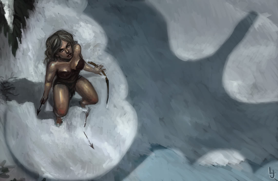
This thread is fantastic and since I really don't think I'm all the great at the whole CnC thing I'm going to post a picture.
I generally do a small piece at the start of everyday just to wake myself up for the work ahead. It's usually just a head or body that takes about 10 to 30 minutes but today I worked a little bit longer.  Harshness: 10 Comments/Notes: Just over an hour or something. It's rough and will probably be damned to my "Stuff that'll never be finished" folder. So yeah, go nuts. Paint Okay?: Yes (Someone tell her to put some more clothes on, she must be freakin' freezing!) Last edited by UraLoo; Aug 06, 2009 at 05:05 AM // 05:05.. Reason: New Pic |
|
|
|
|
Aug 06, 2009, 04:12 AM // 04:12
|
#53 |
|
Wilds Pathfinder
Join Date: Jul 2007
Location: BC Canada
Guild: Guild With No [NAM트]
|
@verene:
i know people have already given plenty of tips for the pose, but i think perhaps looking at the skill animation of a ranger using Pin-Down might help (they're slightly different for male and female). they fall into a similar crouching position. just an idea |
|
|
|
|
Aug 06, 2009, 04:29 AM // 04:29
|
#54 |
|
Pyromaniac
Join Date: Aug 2005
Profession: Mo/W
|
@UraLoo
I can't tell if she's sitting or crouched. I'm assuming sitting, but if that's the case I think the legs look awkward? Seems like the thighs are too thick. Maybe they aren't, but it just feels that way. When I saw the picture I thought of Chun-Li =P. |
|
|
|
|
Aug 06, 2009, 05:10 AM // 05:10
|
#55 | |
|
Academy Page
Join Date: Jul 2009
Location: Melbourne, Australia
Profession: N/Mo
|
Quote:
She's meant to be in this kind of pose. Haven't really pulled that off huh? Updated the image a bit too. |
|
|
|
|
|
Aug 06, 2009, 05:19 AM // 05:19
|
#56 |
|
Pyromaniac
Join Date: Aug 2005
Profession: Mo/W
|
So is she in the middle of getting up? If she's simply holding that stance (I just tried it) it's very uncomfortable.
I see that the viewer is looking directly down one of her knees. If that's the case, then the case can be made that the thigh should be shorter, since the thigh is not bent perpendicularly with respect to the calves, so you'll get foreshortening. The way the picture is drawn right now I either get the sense that she's sitting down, or sitting on a chair, instead of in a midway pose slightly crouched. I wish I could draw on the computer worth a crap to see if what I'm saying even makes sense but :P edit: that picture has real story behind it! you should finish it
Last edited by YunSooJin; Aug 06, 2009 at 05:25 AM // 05:25.. |
|
|
|
|
Aug 06, 2009, 05:52 AM // 05:52
|
#57 |
|
Furnace Stoker
Join Date: Jan 2009
Guild: [SOTA]
Profession: D/
|
To be perfectly frank, she looks as though she's sitting on the toilet or something. It's a bizarre pose, though I can definitely see that trying to get the pose you want from a birds-eye view would be difficult. It's the thighs, really, I think - they simply look too long. Shorten her thighs and show a bit more of her calves, maybe?
(also - girl, put more clothes on! )
|
|
|
|
|
Aug 06, 2009, 09:00 AM // 09:00
|
#58 |
|
Academy Page
Join Date: Jul 2009
Location: Melbourne, Australia
Profession: N/Mo
|
Better or worse?

|
|
|
|
|
Aug 06, 2009, 09:28 AM // 09:28
|
#59 |
|
Pyromaniac
Join Date: Aug 2005
Profession: Mo/W
|
I think it looks better now. The other leg seems a little small though (her left leg seems small, that is)
I think part of the problem with the picture is that you don't get a sense of the level of the field she is on. If she is on a slope, she would be sitting, if it were clearer that she was on a flat field, we'd see the crouching. I'm not sure how you're supposed to clue the viewer in though. edit: maybe a shadow would help define how far away her body is off the ground |
|
|
|
|
Aug 06, 2009, 11:18 AM // 11:18
|
#60 |
|
Academy Page
Join Date: Jul 2009
Location: Melbourne, Australia
Profession: N/Mo
|
Okay, last one. I think anything further than this is beyond my abilities for now (or I'm just being lazy again). I'll be back scantily dressed cavewoman! *shakefist*
|
|
|
|
 |
|

«
Previous Thread
|
Next Thread
»
| Thread Tools | |
| Display Modes | |


 Linear Mode

|
|

All times are GMT. The time now is 07:20 AM // 07:20.
